Let’s have a look at some charts to give us some idea of the state of markets.
10 Year Bond Yield chart
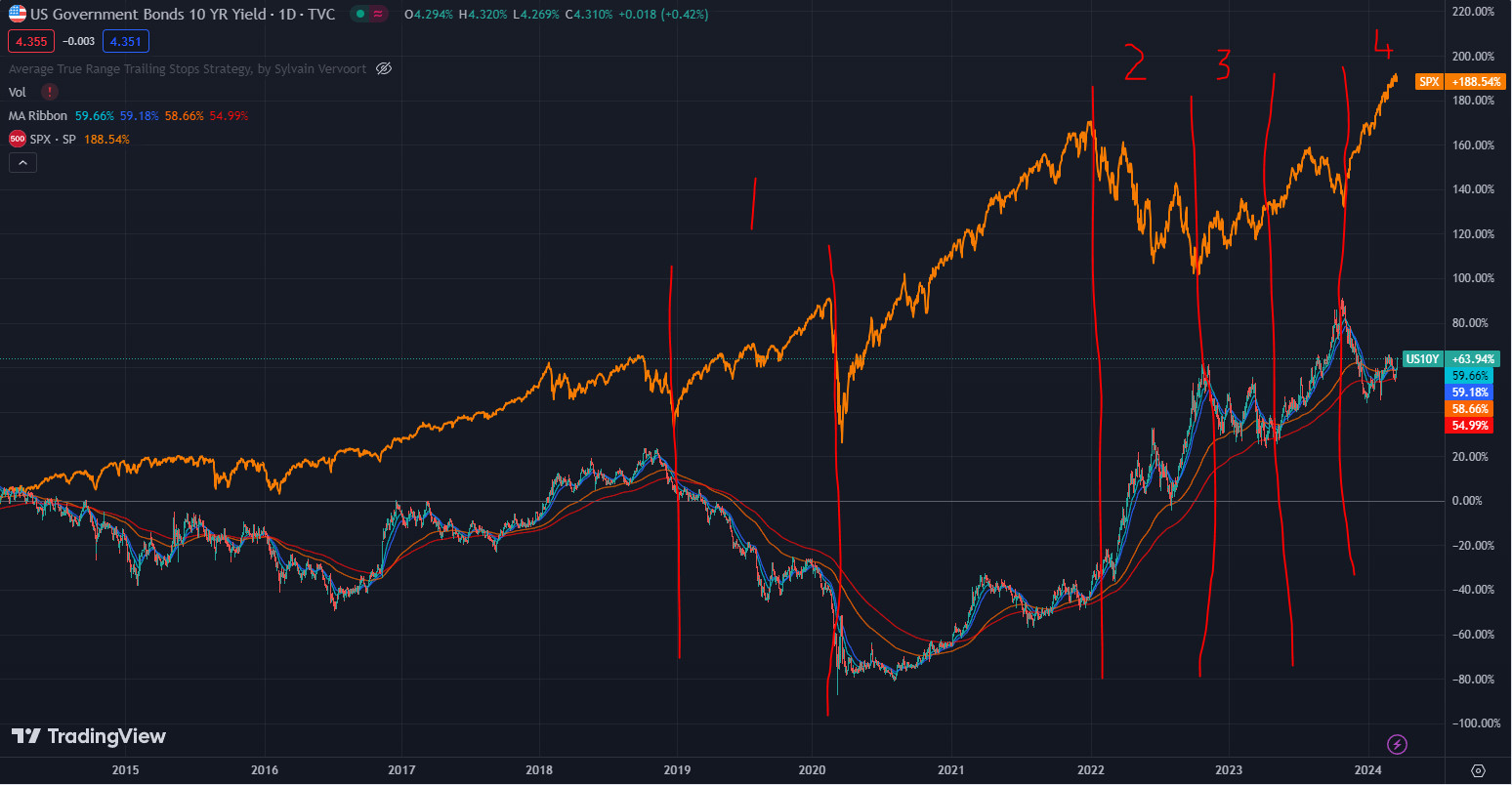
source: tradingview.com
The 10 year Bond yield and the S&P500 by no means have a perfect inverse correlation. However, at certain times, the 10Y has been the strongest influence on the stock market. I have highlighted 4 such times above. We currently sit at a very interesting point. The markets exploded at the end of last-year when it was thought that bond yields had peaked. However, recent data in the US suggests the fall in inflation isn’t going to be in straight-line – at least from now on as the world tries to remove the last 1-2%. On all measures on the chart above, Bond yields are in an uptrend. Yet so is the S&P 500. This can’t remain so forever. At some point the market has to fall or bond yields have to fall.
Crude Oil chart
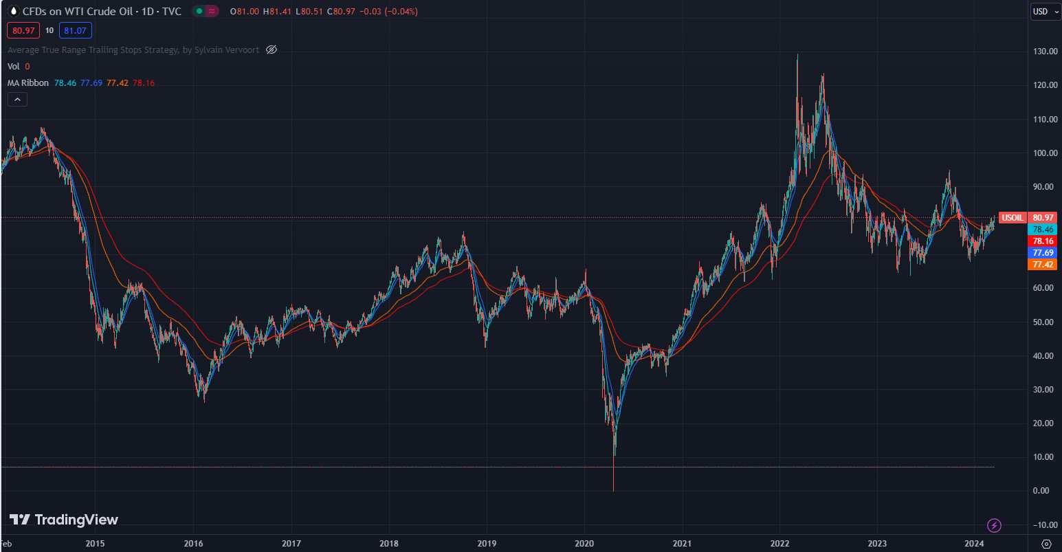
source: tradingview.com
One of the major inputs to inflation is oil. For all of this year, the oil price has been slowly but surely rising. If it continues it will be difficult for inflation to fall and hence bond yields will keep marching higher.
Iron Ore chart
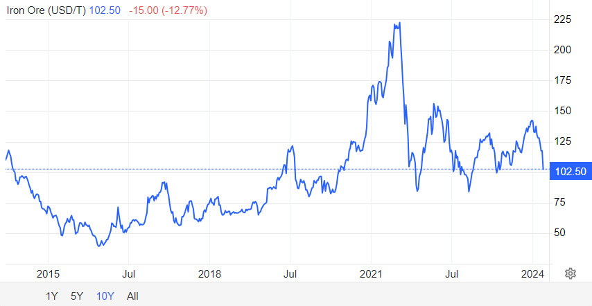
source: tradingeconomics.com
For Australia, iron ore is a crucial commodity. We hold 30% of the planet’s resources of iron ore and lead the world in its production. In 2021-2022 iron ore contributed $133B in export earnings. This long-term chart doesn’t really tell the story of what’s happening at the moment. The Iron ore price falling very quickly from over $140USD/T to $100 will hurt BHP, FMG and RIO which in turn hurts the overall Australian market indices and of course the Australian economy.
Uranium chart
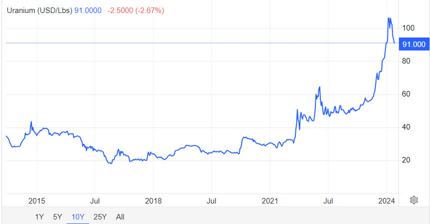
source: tradingeconomics.com
The parabolic rise in the Uranium price continues to unwind.
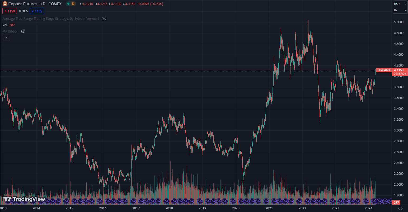
Copper chart
source: tradingview.com
Boring old copper seemed to wake up last week. Sadly there aren’t really any quality stocks on the ASX to play the copper theme. Making up 25% of their EBITDA, at least it helps soften the blow of the iron ore price drop for BHP. Sandfire (ASX:SFR) is the biggest but has been an inconsistent performer for a long time. Nevertheless, it has responded to the latest copper move.
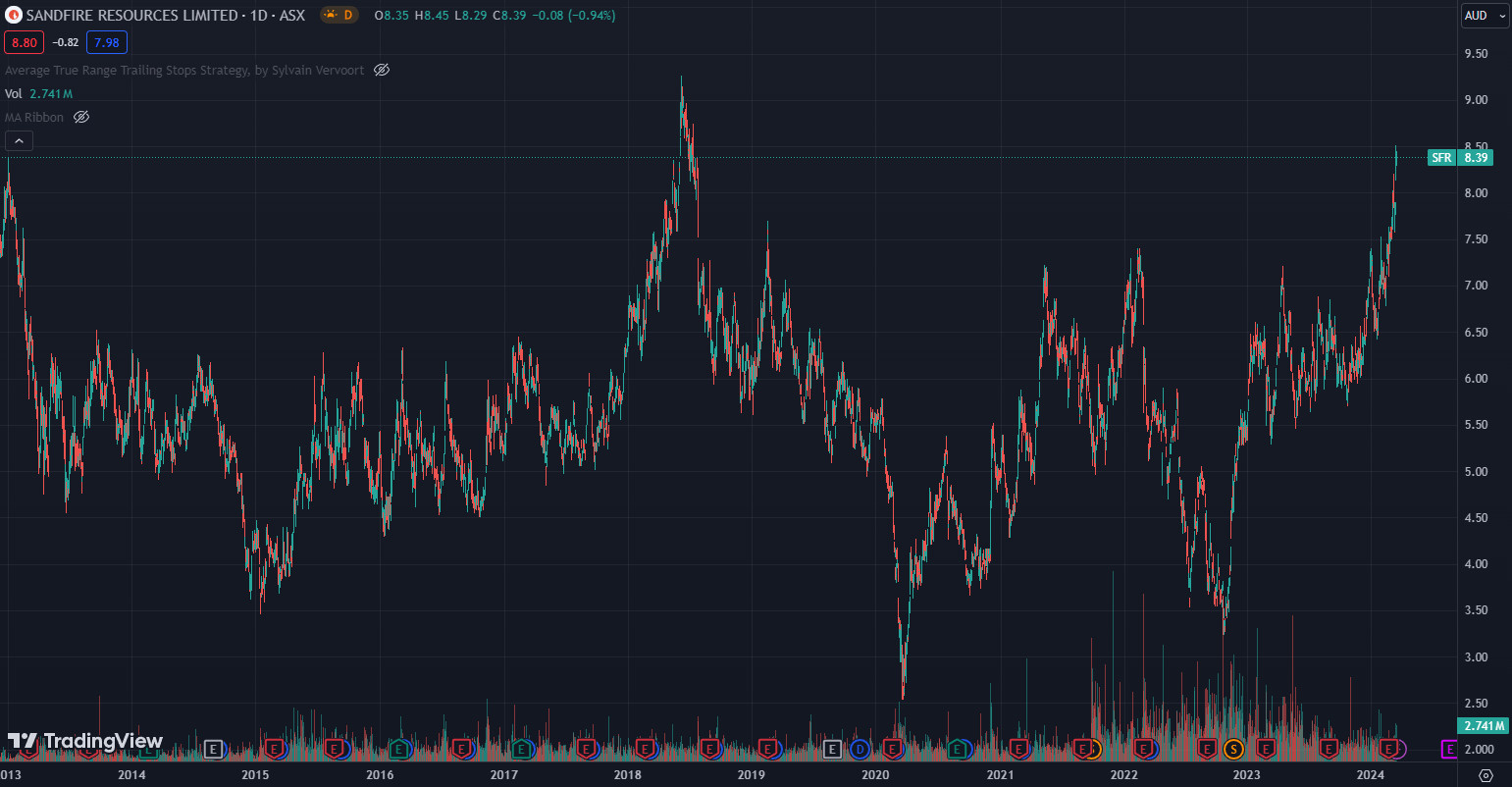
source: tradingview.com
Lithium chart
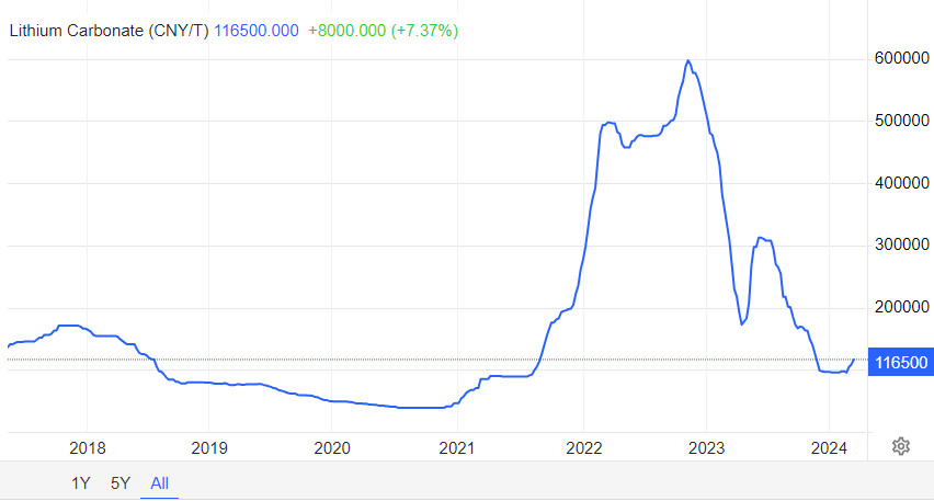
source: tradingeconomics.com
The tiniest signs of life in Lithium has seen some strong moves in the Lithium stocks of late. Many have large short positions so any further moves up in the Lithium price should see outsized gains in the stocks.
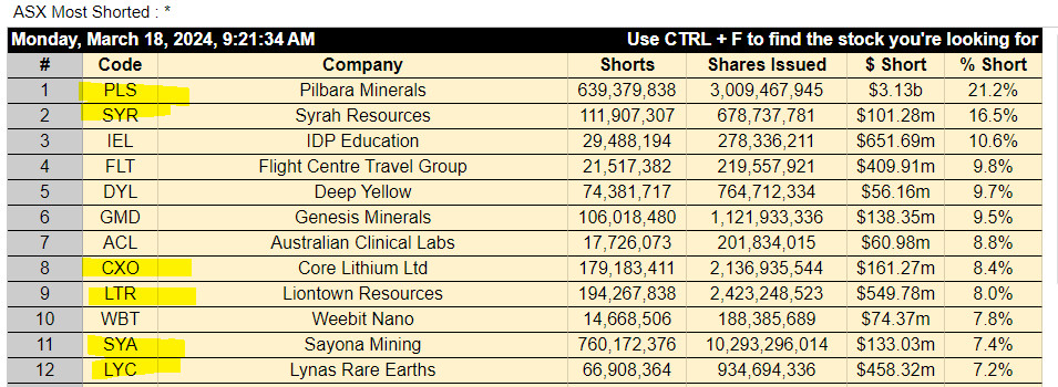
source: https://stocksunderthehood.com/asx-most-shorted-stocks/
Not all of the stocks are highlighted are lithium stocks but all of them are tied to sentiment around the lithium price.
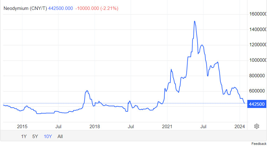
source: tradingeconomics.com
Although this is the Neodymium price. There is no sign of improved sentiment here yet. Neodymium is a rare earth and the major source of income for Lynas (ASX:LYC) – #12 on the short list above.
Disclaimer: This information is provided purely for educational purposes. It takes no account of an individual’s personal financial circumstances and hence can in no way constitute financial advice. The above data may be subject to errors or inconsistencies for which the author takes no liability. It is imperative that all investors do their own research or if they need advice, seek it from a qualified financial adviser.